Alps Map
The Idea
I’ve always enjoyed maps and during the previous couple of years I’ve had a lot of time of free time at home, so I started investigating making maps of my own. I had a map of the Alps from an old atlas I’d purchased at a flea market and I decided to see if I could make something like that, but much larger, 24" x 36" instead of approximately 8" x 10". The final product came out pretty great I think.
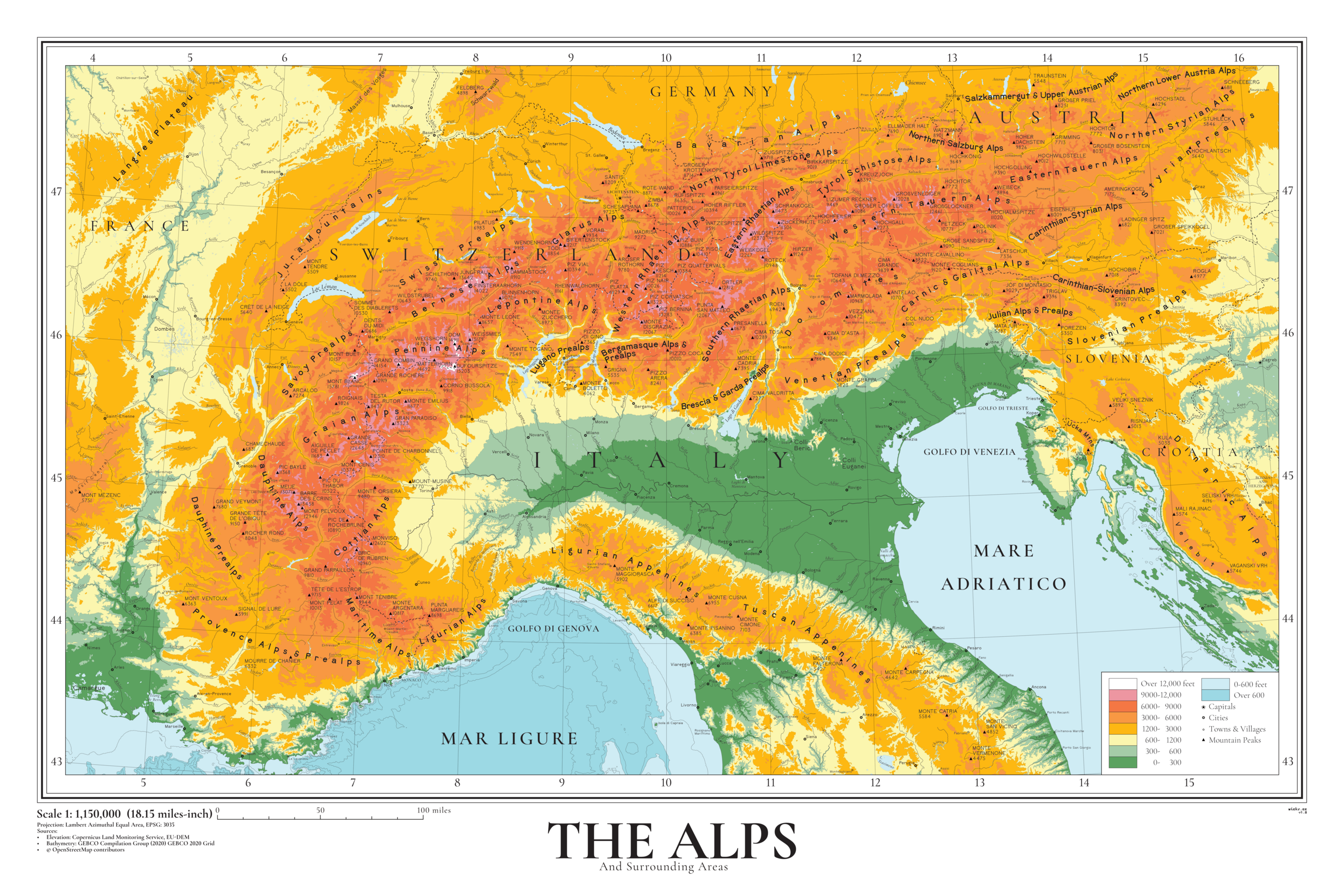
The Map

The Map
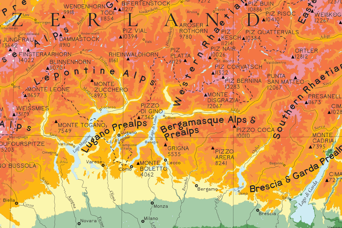
Detail view
Higher resolution here
The Process
The hardest part about making a map I’ve found is figuring out which datasets to use and how to filter and shape them to fit the goals of your map. In the case of this map, the following layers were used.
Base Contours
These were based on the EU-DEM elevation model from the EU’s Copernicus Program. The conversion of the raw DEM data to contour polygons was done via GDAL. This process was a bit of a stumbling block, as the large DEM formed by the mosaic of the tiles required to cover the entirety of the Alps, the polygon generation time became untenable. A quick search of GitHub turned up a relevant bug and after a couple attempts I had a patch that allowed me to generate the entire set of polygons in a much more reasonable time. As a bonus, the patch was accepted upstream and I was able to become a contributor to GDAL as well!
Rivers
Based on data from OpenStreetMap. One of the biggest challenges was deciding which rivers to include and which not to included. I knew that I wanted to include some major rivers, e.g. the Po and the Adige, so to start I wrote a few small scripts to remove rivers that had no name or were very short. However, I still had far too many rivers after this process and so I spent a lot of time going through each region and trying to decide which rivers to include and which to drop from the map. This is definitely an area that I would like to improve upon in the future, as the manual process took a lot of time and I think more time invested in the front-end in data processing could have paid dividends. Once I’d chosen which rivers I wanted, I needed to reduce the amount of detail a little bit, as even at my large target size, the rivers just had too much detail. The geometry generator features in QGIS made this pretty easy, as I could just tweak a combination of the simplify and smooth functions until I had something that looked good at the target size. This is another area that I’d love to figure out a better approach for, as it took a long time to find good parameters and it seems like there might be a way to get closer to optimal results given that the size of the input features and the size of the output map are known.
Mountain Peaks
A mix of importing these from OpenStreetMap and manually digitization. In retrospect, I should have tried to extract more peak features from OpenStreetMap as I had to manually look up and copy the height and name data for all the peaks I digitized myself, a lengthy process.
Bathymetry
Very similar to the process for the land contours, the data here was obtained from GEBCO.
Cities
Similar to the peaks, a combination of OpenStreetMap data and manual digitization. Much of the distinction between the two classes of city on the map is based on what seemed true to me based on my experience and whatever Wikipedia said about a given place, but it’s certainly the case that there are some cities that could plausibly be in either tier. In the end, I just picked whichever felt right.
The Labels
For labeling the map, I used 2 fonts, Cormorant Garamond for a serif font and Bell Topo Sans for a sans serif. Huge thanks to Sarah Bell for responding to my email and adding a few missing characters I needed for the map!
Mountain Ranges
One thing I learned while creating this map is that there are competing systems for defining sub-ranges of the Alps. I chose to use one of the more modern interpretations as it seemed to be the most consistent across the entire range.
The Projection
For a projection, I chose the Lambert Azimuthal Equal Area projection, specifically EPSG: 3035, which is recommended by the EEA for display maps.
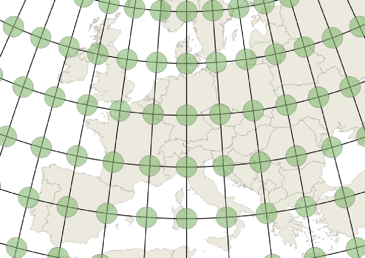
Tissot's indicatrix for EPSG 3505, showing the low distortion across Europe, especially for the Alps region
Bringing it all together
The general process for this map was to prepare vector data and symbology in QGIS, then export it as a vector PDF and import those into Affinity Designer. Once there, I added all the labels and label knockouts manually. This was a long process, but a fulfilling one. The entire outer frame and bottom area were also designed in Affinity Designer. Overall, Affinity Designer was a pretty good tool for this project, although once I brought in all the contour layers it did get a little slow and an export of the final map from Affinity Designer to pdf took a very long time.